前言
大家好,这里是 CSS 魔法使——alphardex。
我对动画创作有着巨大的兴趣,平时你们能够经常在掘金的沸点上看到我创作的各种各样的动画作品。于是乎,我就决定将我所使用的各种技巧总结起来,让大家也能愉快地玩耍 CSS 动画。
好了,话不多说。让我们一起进入 CSS 动画这个领域吧!
小彩蛋:本文的标题 neta 了“化物语”,是笔者最喜欢的动画系列之一,里面的动画非常具有表现力,强烈推荐大家去看。
CSS 动画简介
平时,我们习惯了用 CSS 来实现各种的静态页面布局。但是呢,设计得再好看的页面如果缺少动画,就会像一个缺少灵魂的空壳一般毫无生机。那么如何赋予页面以灵魂呢?答案就是动画。
在 CSS 世界中,实现动画主要有 2 种方式:transition 和 animation,在本文我们重点探讨的是后者,也就是动画。
首先简要说说 transition 吧:transition 即过渡,意思是从一种状态变化到另一种状态。但是,如果我们需要元素能在多个状态之间切换,甚至还能循环播放,那么 transition 就显得无能为力了。这时我们就要借助强大的animation属性了
首先,让我们来看以下的一个动画

感觉如何?有点酷对吧,但当我们看它的源代码时,才发现居然要整整 12 个关键帧,还没算上时间轴的编排
由此可见,一个复杂的动画背后是由许多小动画编排而成的,就如同乐队的演奏一般,只有经过指挥家精心的指挥才能演奏出美好的乐章。而你,就是 CSS 动画的指挥家。
如何学习动画
一言以蔽之:化动为静。
动画的本质其实就是一张张图片快速地切换播放而已,利用了人脑的视觉暂留效应才形成了动画效果。如果想学习动画,那么必然要把动画里的每一张静态帧都单独抽离出来。或许,有的人相信自己有动态视力可以不这么做,但这样必然会错失很多细节,而细节恰恰决定了动画的成败。
可能很多前端都用过腾讯智图这个软件吧?平时用它来批量压缩图片还是蛮爽的,但是里面内置的ImageMagick却有个鲜为人知的实用功能——将 gif 的帧批量转化为 png。命令行上使用很简单:
1
| convert -coalesce target.gif target_%d.png
|
实操一下吧,将上一节的动画 gif 保存到本地,运行如上的命令,你就会得到该动画所有的静态帧
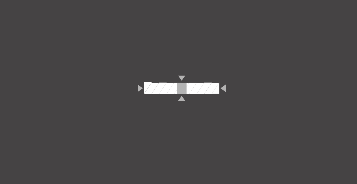
有点多对不对?别慌,先把关键帧给提取出来。关键帧是什么呢?就是动画从 A 状态切换到 B 状态时的 2 个状态的帧,省去了中间的所有过渡帧,以下是该动画的 3 张关键帧


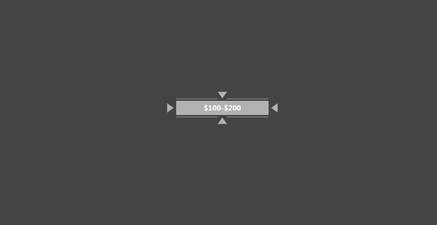
通过这 3 张关键帧,我们就能完成一项很重要的任务——布局。
就算是动画也离不开布局,根据画面上的所有元素,我们可以写出如下的 HTML 结构
1
2
3
4
5
6
7
8
9
10
11
12
13
14
15
16
17
18
19
20
21
22
23
24
25
26
27
28
29
30
31
32
33
34
35
36
37
38
39
40
41
42
43
44
45
46
47
48
49
| <div class="relative flex items-center justify-center">
<div class="bar-1">
<div class="arrow left"></div>
<div class="flex flex-col items-center self-stretch">
<div class="lines top">
<div class="line"></div>
<div class="line"></div>
</div>
<div class="block">
<span class="staggered-scale-in">High stakes table</span>
</div>
<div class="lines bottom">
<div class="line"></div>
<div class="line"></div>
</div>
</div>
<div class="arrow right"></div>
</div>
<div class="bar-2">
<div class="clips">
<div class="clip"></div>
<div class="clip"></div>
<div class="clip"></div>
<div class="clip"></div>
<div class="clip"></div>
<div class="clip"></div>
<div class="clip"></div>
<div class="clip"></div>
<div class="clip"></div>
<div class="clip"></div>
<div class="clip"></div>
</div>
<div class="arrows">
<div class="arrow top"></div>
<div class="arrow right"></div>
<div class="arrow bottom"></div>
<div class="arrow left"></div>
</div>
<div class="block">
<span class="staggered-scale-in">$100-$200</span>
</div>
<div class="lines">
<div class="line left-top"></div>
<div class="line right-top"></div>
<div class="line left-bottom"></div>
<div class="line right-bottom"></div>
</div>
</div>
</div>
|
接下来就是写布局了,布局可谓是仁者见仁智者见智,各有各的写法,这里就提几个要点吧:
- 诸如箭头、三角形、平行四边形等形状可以用 clip-path 来绘制,用好这个在线的工具网站就行
- 布局尽量用 flex 实现,因为它是当代的 CSS 布局之王
- CSS 最重要的就是微调,好好利用 devtools 里面的 CSS 面板吧,它会祝你一臂之力的
当你成功地完成了布局后,就要开始想办法让它动起来了。
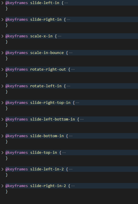
首先通过上面的 3 个关键帧结合原动画可以知道该动画能分为 3 个部分:
第一部分:2 个箭头arrow从左右出现并向各自的方向划去;中间的红条block伸展出来;红条上下方的线line伸展出来;文字span交错出现;整体bar-1旋转消失
第二部分:另一个整体bar-2旋转进入;上下方交错排列的平行四边形clip交错地向中间斜向移动;4 个箭头arrow从上下左右出现并向各自的方向划去
第三部分:中间的灰条block伸展出来;文字span交错出现;四条线line同时伸展出来
接下来,让我们来逐句分析吧
(注:由于本文并非从零开始的动画教程,因此animation 的详细用法本文并不会提及,请读者先自行做好功课再阅读下一部分)
准备工作
笔者之前写了一个自己用的 CSS 框架——aqua.css,里面内置了许多有用的工具类(包括许多动画的缓动函数),将其引入我们的 html
1
2
3
4
| <link
rel="stylesheet"
href="https://cdn.jsdelivr.net/npm/@alphardex/aqua.css@1.5.5/dist/aqua.min.css"
/>
|
第一部分

2 个箭头arrow从左右出现并向各自的方向划去,此句对应的关键帧和动画如下
1
2
3
4
5
6
7
8
9
10
11
12
13
14
15
16
17
18
19
20
21
22
23
24
25
26
27
28
29
30
31
| .arrow {
&.left {
animation: slide-left-in 1s var(--ease-out-quart) both;
}
&.right {
animation: slide-right-in 1s var(--ease-out-quart) both;
}
}
@keyframes slide-left-in {
from {
transform: translateX(1000%);
opacity: 0;
}
to {
transform: translateX(0);
}
}
@keyframes slide-right-in {
from {
transform: translateX(-1000%);
opacity: 0;
}
to {
transform: translateX(0);
}
}
|
中间的红条block伸展出来
1
2
3
4
5
6
7
8
9
10
11
12
13
| .block {
animation: scale-x-in 1.2s 0.15s var(--ease-out-quart) both;
}
@keyframes scale-x-in {
from {
transform: scaleX(0);
}
to {
transform: scaleX(1);
}
}
|
红条上下方的线line伸展出来
1
2
3
| .line {
animation: scale-x-in 0.8s var(--ease-out-quart) both;
}
|
文字span交错出现(注意这里要先用 JS 分割一下文字并应用交错动画,用到了 gsap 的SplitText插件,它还有个免费的替代品Splitting)
1
2
3
4
5
6
7
8
9
10
11
12
13
14
15
16
17
18
19
20
21
22
| .scale-in-bounce {
opacity: 0;
animation: scale-in-bounce 0.2s both;
animation-delay: calc(var(--basic-delay) + 0.05s * var(--i));
}
@keyframes scale-in-bounce {
0% {
opacity: 0;
transform: scale(2.5);
}
40% {
opacity: 1;
transform: scale(0.8);
}
100% {
opacity: 1;
transform: scale(1);
}
}
|
1
2
3
4
5
6
7
8
| const split = new SplitText(".staggered-scale-in", {
type: "chars",
charsClass: "scale-in-bounce",
});
split.chars.forEach((item, i) => {
item.style.setProperty("--basic-delay", "0.7s");
item.style.setProperty("--i", `${i}`);
});
|
整体bar-1旋转消失
1
2
3
4
5
6
7
8
9
10
| .bar-1 {
animation: rotate-right-out 0.3s var(--bar-1-duration) both;
}
@keyframes rotate-right-out {
to {
transform: rotate(90deg);
opacity: 0;
}
}
|
第二部分

另一个整体bar-2旋转进入
1
2
3
4
5
6
7
8
9
10
| .bar-2 {
animation: rotate-left-in 0.3s var(--bar-1-duration) both;
}
@keyframes rotate-left-in {
from {
transform: rotate(-45deg);
opacity: 0;
}
}
|
上下方交错排列的平行四边形clip交错地向中间斜向移动(这里用到了 nth-child 伪类来选择奇数和偶数项)
1
2
3
4
5
6
7
8
9
10
11
12
13
14
15
16
17
18
19
20
21
22
23
24
25
26
27
28
29
30
31
32
33
| .clip {
&:nth-child(odd) {
animation: slide-right-top-in 0.8s var(--ease-out-quart) both;
}
&:nth-child(even) {
animation: slide-left-bottom-in 0.8s var(--ease-out-quart) both;
}
}
@keyframes slide-right-top-in {
from {
transform: translate(50%, -100%);
opacity: 0.5;
}
to {
transform: translate(0, 0);
opacity: 1;
}
}
@keyframes slide-left-bottom-in {
from {
transform: translate(-50%, 100%);
opacity: 0.5;
}
to {
transform: translate(0, 0);
opacity: 1;
}
}
|
4 个箭头arrow从上下左右出现并向各自的方向划去
1
2
3
4
5
6
7
8
9
10
11
12
13
14
15
16
17
18
19
20
21
22
23
24
25
26
27
28
29
30
31
32
33
34
35
36
37
38
39
40
41
42
43
44
45
46
47
48
49
50
51
52
53
54
55
56
57
58
59
60
61
62
63
64
65
66
67
68
| .arrow {
&.top {
animation: slide-bottom-in 0.8s var(--bar-2-delay) var(--ease-out-quart)
both;
}
&.right {
animation: slide-left-in-2 0.8s var(--bar-2-delay) var(--ease-out-quart)
both;
}
&.bottom {
animation: slide-top-in 0.8s var(--bar-2-delay) var(--ease-out-quart) both;
}
&.left {
animation: slide-right-in-2 0.8s var(--bar-2-delay) var(--ease-out-quart)
both;
}
}
@keyframes slide-bottom-in {
from {
transform: translateY(300%);
opacity: 0.5;
}
to {
transform: translateY(0);
opacity: 1;
}
}
@keyframes slide-top-in {
from {
transform: translateY(-300%);
opacity: 0.5;
}
to {
transform: translateY(0);
opacity: 1;
}
}
@keyframes slide-left-in-2 {
from {
transform: translateX(-1150%);
opacity: 0.5;
}
to {
transform: translateX(0);
opacity: 1;
}
}
@keyframes slide-right-in-2 {
from {
transform: translateX(1150%);
opacity: 0.5;
}
to {
transform: translateX(0);
opacity: 1;
}
}
|
第三部分
中间的灰条block伸展出来(跟之前的红条几乎一模一样)
1
2
3
4
5
6
| .bar {
animation: scale-x-in 1.2s calc(var(--bar-2-delay) + 0.6s) var(
--ease-out-quart
)
both;
}
|
文字交错出现同上
最后,四条线line同时伸展出来(注意它们的朝向不同,因此要更改它们的运动中心点)
1
2
3
4
5
6
7
8
9
10
11
12
13
14
15
16
17
18
19
20
21
22
23
24
25
26
27
28
29
30
31
32
33
| .line {
&.left-top {
transform-origin: right;
animation: scale-x-in 0.8s calc(var(--bar-2-delay) + 0.8s) var(
--ease-out-quart
)
both;
}
&.right-top {
transform-origin: left;
animation: scale-x-in 0.8s calc(var(--bar-2-delay) + 0.8s) var(
--ease-out-quart
)
both;
}
&.left-bottom {
transform-origin: right;
animation: scale-x-in 0.8s calc(var(--bar-2-delay) + 0.8s) var(
--ease-out-quart
)
both;
}
&.right-bottom {
transform-origin: left;
animation: scale-x-in 0.8s calc(var(--bar-2-delay) + 0.8s) var(
--ease-out-quart
)
both;
}
}
|
最后的成品:猛戳这里
完成一个作品固然值得庆贺,但完成的过程也很重要,因为通过这个过程,你也在学习动画相关的方法论,如果掌握了门道,以后再复杂炫酷的动画相信你也能手到擒来
CSS 动画技巧
通过上面的学习相信你已经感受到 CSS 动画的魅力了吧。接下来笔者会讲一些常用的动画技巧,用好这些技巧能写出更具有多样性的动画来
交错

以上是一个缩放相关的动画,注意到放大的方块有 4 个,且都是放大到自身的大小,如果给它们加上不同的延时,就能达成交错的动画效果
1
2
3
4
5
6
| <div class="blocks">
<div class="block block-1"></div>
<div class="block block-2"></div>
<div class="block block-3"></div>
<div class="block block-4"></div>
</div>
|
1
2
3
4
5
6
7
8
9
10
11
12
13
14
15
16
17
18
19
20
21
22
23
24
25
26
27
28
29
| .block {
animation: scale-in-center 0.8s var(--ease-out-cubic) both;
&-1 {
animation-delay: 0;
}
&-2 {
animation-delay: 0.3s;
}
&-3 {
animation-delay: 0.45s;
}
&-4 {
animation-delay: 0.6s;
}
}
@keyframes scale-in-center {
from {
transform: scale(0);
}
to {
transform: scale(1);
}
}
|
本 demo 地址:Motion Table - Symmetric Scale
描边

六边形可以通过矢量绘图软件绘制而成(笔者用的是InkScape)
描边效果要控制这两个属性:stroke-dasharray和stroke-offset,前者控制 svg 的点划线长度,后者控制 svg 点划线的偏移量,当前者足够大时,控制后者的值便能达成描边效果
1
2
3
4
5
6
7
8
9
10
11
12
13
14
15
16
17
18
19
20
21
22
23
24
25
26
| <div class="hexagon" style="--i: 1">
<svg
width="6rem"
viewBox="0 0 68.982 79.653"
xmlns="http://www.w3.org/2000/svg"
class="half left"
>
<path
d="M34.492 78.5L1.001 59.164V20.492L34.492 1.156l33.491 19.336v38.672z"
fill="none"
stroke-width="2"
/>
</svg>
<svg
width="6rem"
viewBox="0 0 68.982 79.653"
xmlns="http://www.w3.org/2000/svg"
class="half right"
>
<path
d="M34.492 78.5L1.001 59.164V20.492L34.492 1.156l33.491 19.336v38.672z"
fill="none"
stroke-width="2"
/>
</svg>
</div>
|
1
2
3
4
5
6
7
8
9
10
11
12
13
14
15
16
17
18
19
20
| .hexagon {
.half {
stroke-dasharray: 233;
animation: stroke-in 1s both;
&.right {
transform: scaleX(-1);
}
}
}
@keyframes stroke-in {
from {
stroke-dashoffset: 236;
}
to {
stroke-dashoffset: 117;
}
}
|
本 demo 地址:Motion Table - Repeat Scale
环形运动
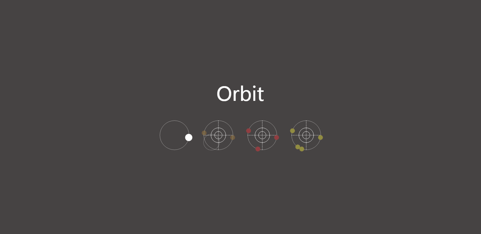
首先父元素毫无疑问是绕中心 360 旋转,关键就是子元素的位移距离要等于环的半径,这样就能达成环形旋转的效果了
1
2
3
| <div class="orbit">
<div class="point"></div>
</div>
|
1
2
3
4
5
6
7
8
9
10
11
12
13
14
15
16
17
18
19
| .orbit {
.point {
animation: spin var(--spin-duration) var(--spin-delay) linear infinite;
&::before {
transform: translateX(calc((var(--orbit-width)) / 2));
}
}
}
@keyframes spin {
from {
transform: rotate(0);
}
to {
transform: rotate(1turn);
}
}
|
本 demo 地址:Motion Table - Orbit
3d 视角
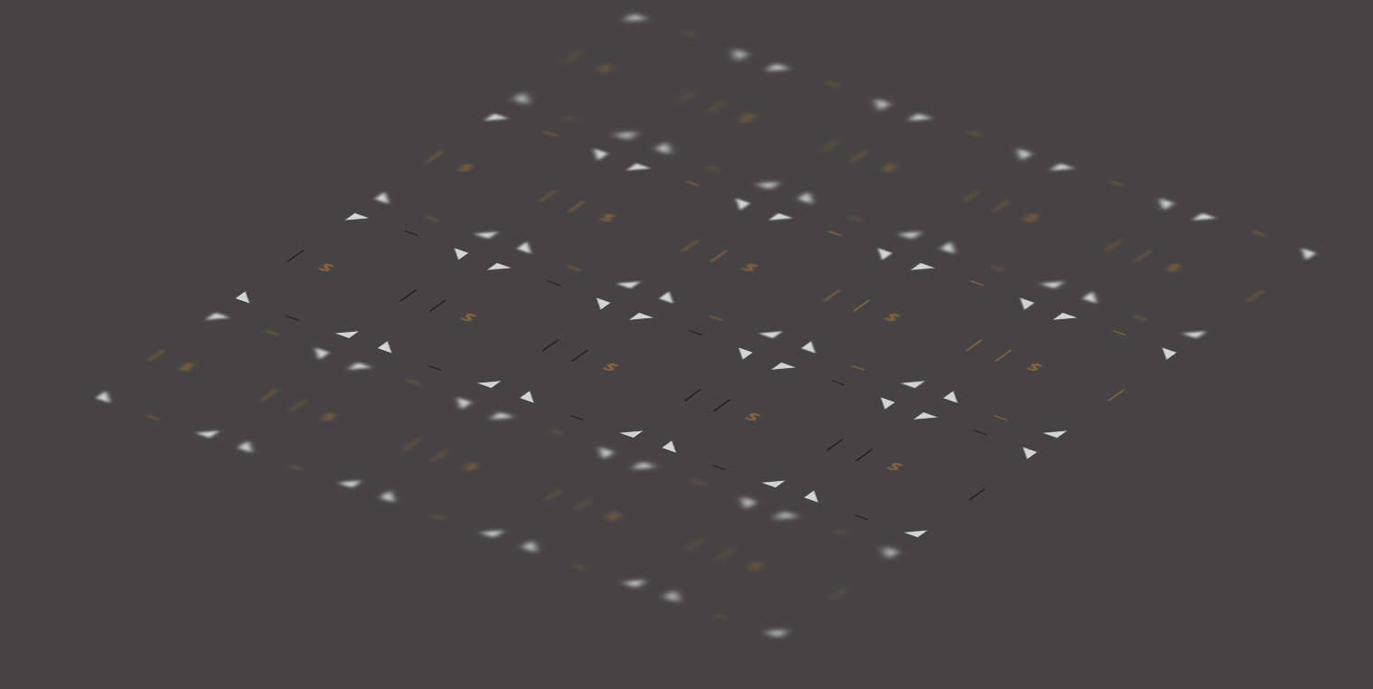
父元素设置transform-style: preserve-3d和perspective,子元素进行 3D 变换即可
1
2
3
4
5
6
| <div class="camera">
<div class="cards">
<div class="card"></div>
...
</div>
</div>
|
1
2
3
4
5
| .camera {
transform-style: preserve-3d;
perspective: 200px;
transform: rotateX(60deg) rotateZ(35deg) scale(1.1);
}
|
本 demo 地址:Motion Table - Depth Of Field
其实 ios 通知的折叠也是典型的 3d 变换,以下是它的 CSS 动画版实现

看到彩蛋了吗?没错,是春物
本 demo 地址:IOS Notification Fold Toggle
随机性
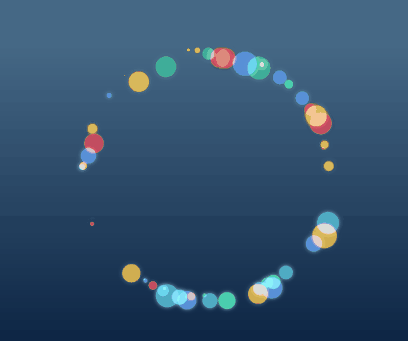
主要用到以下 2 个 SCSS 的 Mixin 来生成随机的数据
1
2
3
4
5
6
7
8
9
| @function random_range($min, $max) {
$rand: random();
$random_range: $min + floor($rand * (($max - $min) + 1));
@return $random_range;
}
@function sample($list) {
@return nth($list, random(length($list)));
}
|
本 demo 地址:Bubble Ring
截断法

主要利用了overflow: hidden这个属性来把多余的部分截掉,可以用来模拟各种效果(比如描边)
本 demo 地址:Frame Text Reveal
最后
依旧是一个彩蛋
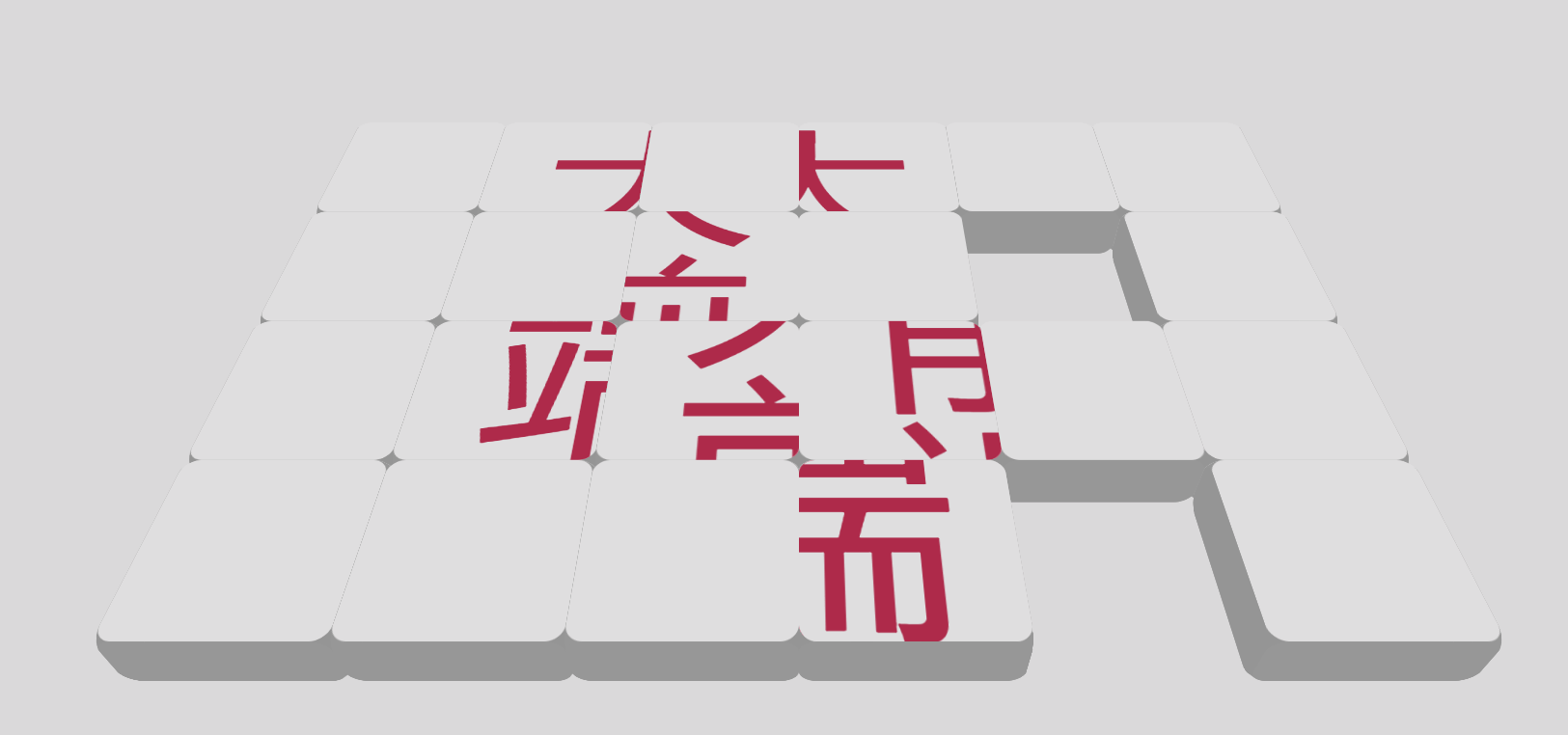
该动画的灵感来源:凭物语第 3 集开头
本 demo 地址:3D Puzzle Animation